Once Upon A Time…
… a long time ago, when I first tried to be a freelance web designer in college, I tried to code out (with what I now know was very little coding knowledge) a family friends’ website for their small business.
It was a disaster.
I could code the general framework, images and content with HTML, add splashes of color, fix alignment, spacing, and change fonts with CSS. I basically could make an online brochure with links to different brochure-looking pages. But beyond that, I was useless. The client was a local equipment rental business, so obviously they wanted a way to track rental inventory. “SURE! I can do that!” Nope. Apparently, inventory management was WAY over my head, as it would require a lot more coding knowledge than I knew at that time. Unfortunately, I didn’t realize this until I was already in the thick of it. I was embarrassed! I couldn’t give my client what they wanted because I just didn’t know how!
Luckily, I could chalk it up to being young and dumb, and they forgave me (and even generously paid me for what I had done already), and we’re still very close to them - in fact, even closer now that I’ve moved back to Maine!
That was back then… and times sure have changed! Enter the age of WYSIWYG website design.
Why Do I use Squarespace?
With so many different website design services out there, why do I choose to use Squarespace?
There are several articles already that answer this question - Paige Brunton is an amazing Squarespace resource, and answers that question thoroughly in her own blog post. So does Lauren Hooker from Elle & Company in her blog post.
So even though everyone’s already said everything about the subject, I’ll throw in my $.02 anyways!
It’s designed for designers (and non-designers, too!)
Right out of the box, Squarespace’s templates are clean, modern, sophisticated and stylish. The building blocks of Squarespace’s website builder have the perfect amount of padding (or space around elements) built right in to give every element on the page the proper amount of breathing room. This ultimately gives Squarespace templates a clean, simple and “airy” look to them. And while you COULD replicate that with other website programs, this does it without you having to think about it!
The interface to build pages is incredibly user-friendly, especially for tech-savvy people, but even for those who aren’t! The management system is very well thought out, and organized in such a way that it actually makes sense! Here’s a glimpse of what the back-end of Squarespace looks like:
Here’s a view of the main menu for my website! If you want to create or edit your pages, simply click “Pages.”
Here’s a view of the left menu section, when I’m in the Pages section of the main menu.
Clicking the “+” icon in Page or Navigation sections brings up a clean, simple overlay to choose the type of page or content you want to add.
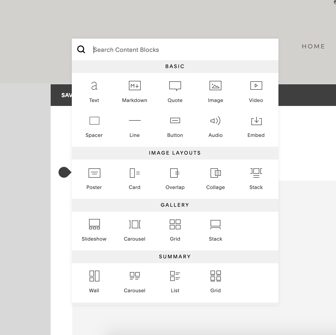
Once you’re on a page, and you’re ready to add Content Blocks (like text, images, products, etc.), simply hover over the page area to reveal input area pointers, and click to open this Content Block Option overlay.
Adding an image reveals this overlay, where you can add the image from your computer, change the design of the image, and even add animations!
Squarespace takes care of itself
Since your site is fully hosted on Squarespace’s servers, you (or an expensive developer) don’t need to worry about security updates or bug fixes, and you’ll always get the latest and greatest updates pushed directly to your account. Did Squarespace come out with a new feature? Great, you’ve already got it! Anything that you would have to pay a developer to take care of if you were hosting and developing your site yourself, is already taken care of by Squarespace’s team. You can sit back, relax, and let your site work hard for you… and not be working hard on your site!
All inclusive, no add-ons needed
Unlike open-source website builders like Wordpress, Squarespace keeps everything that is allowed into a Squarespace website VERY tightly controlled. There’s no such thing as “adding plug-ins” from third-party companies to add features to your site. This may seem restrictive, and it can be in some regards, but Squarespace really strives to already have everything you need at the tip of your fingers! Sure, you can enable the full “Developer Mode” on Squarespace and code your little heart out for a fancy, super custom site… but Squarespace generally has enough functionality built right in, and managed closely by a team of very smart developers, so everything works just the way it should - every time, on every template.
That’s not to say that there aren’t really cool features that can be added by using the Custom Code section, and there are plenty of really great resources to find this code and implement it on your site. It’s recommended that you have someone experienced to add any custom code to your site, as the Squarespace support team may be limited in their ability to help you out.
A Super supportive support team
Speaking of the support team, Squarespace’s support team is EPIC. They’re there for your 24/7 - so when I hand off your website to you, and you have any questions at all, if I’m not available, you can chat with the support team any time. They really do their best to assist you as quickly as possible. A perk of me being a Squarespace “Circle Member” is that we get priority in the support queue. That means if you’re a client of mine, I can likely get an answer for your pronto! But even if you ask the team yourself, they’re really great to work with and will be as fast as they can be!
Every rose has it’s thorn…
Now, as much as I love Squarespace, it does have it’s flaws… but then again… don’t we all?
When should you NOT use Squarespace?
There are times when hiring me to do your website on Squarespace just wouldn’t be a great fit! Businesses who need a LOT of customization and complexity on their site probably wouldn’t want to use a drag-and-drop website editor like Squarespace, and would probably be better off hiring an actual developer.
Versioning & When Changes are made live
This is something that bothers me quite a bit: If you make changes to your site, then really mess it up somehow, there’s no going back to a previous version. There IS an “undo” feature, but that is only good up until you click “Save.” Speaking of clicking “Save”, once your site is live (and set to public), any changes you make will be visible to the world as soon as you hit “Save” again. If you’re working on updating a certain section of a page, and want to step away for a while, you can’t just save the updates, but not publish it to the world. According to Squarespace, there are some work arounds to help you out:
Mobile Design is locked in
Finally, I have to commend Wix on doing a great job at allowing mobile-specific customization. Squarespace definitely lacks in this department, as it strictly creates a stacked, responsive version of your desktop site. Wix allows you to hide, add, or re-arrange elements specifically for mobile devices, without affecting how your desktop site looks. I’ve run into issues with Squarespace where I really want to hide some icons on mobile, because they are just taking up too much valuable real estate - but I can’t, without removing them from the desktop site as well. This is something I sincerely hope that Squarespace will look into fixing in the near future. It bothers me enough that I MAY even consider using Wix as an alternative site builder (along with Squarespace) for future client projects.
Well, there you have it…
Thanks for listening to my opinions on Squarespace, and why I enjoy using it for my client projects.


